UX|UI Design
Highlighting the AI technology of the Newsroom’s app
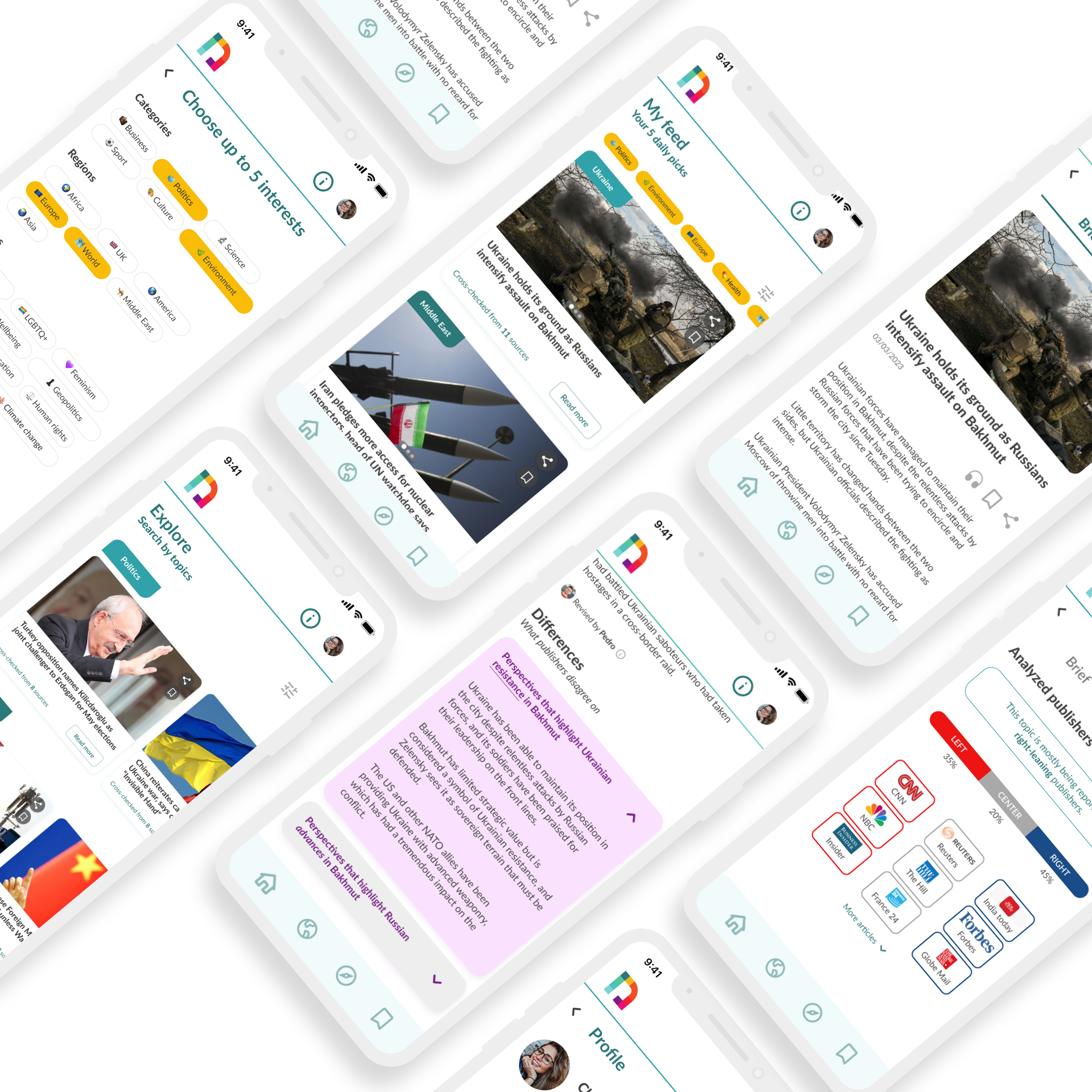
Improvement of the existing app
Challenges
Improve existing app: Applying the design thinking approach to highlight the value proposition of the concept of the app, increase the transparency of their AI technology and overall simplify navigation and intuitiveness.
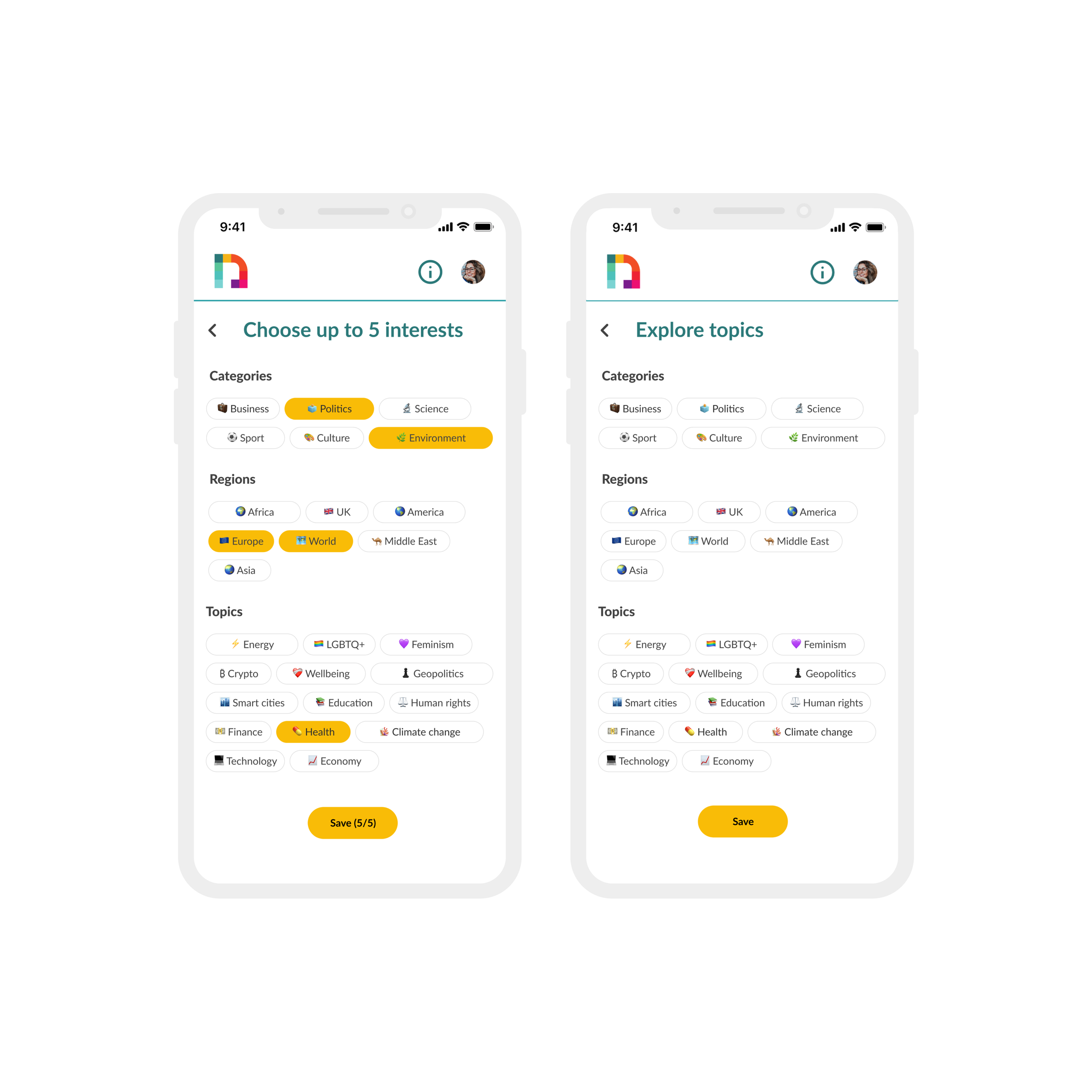
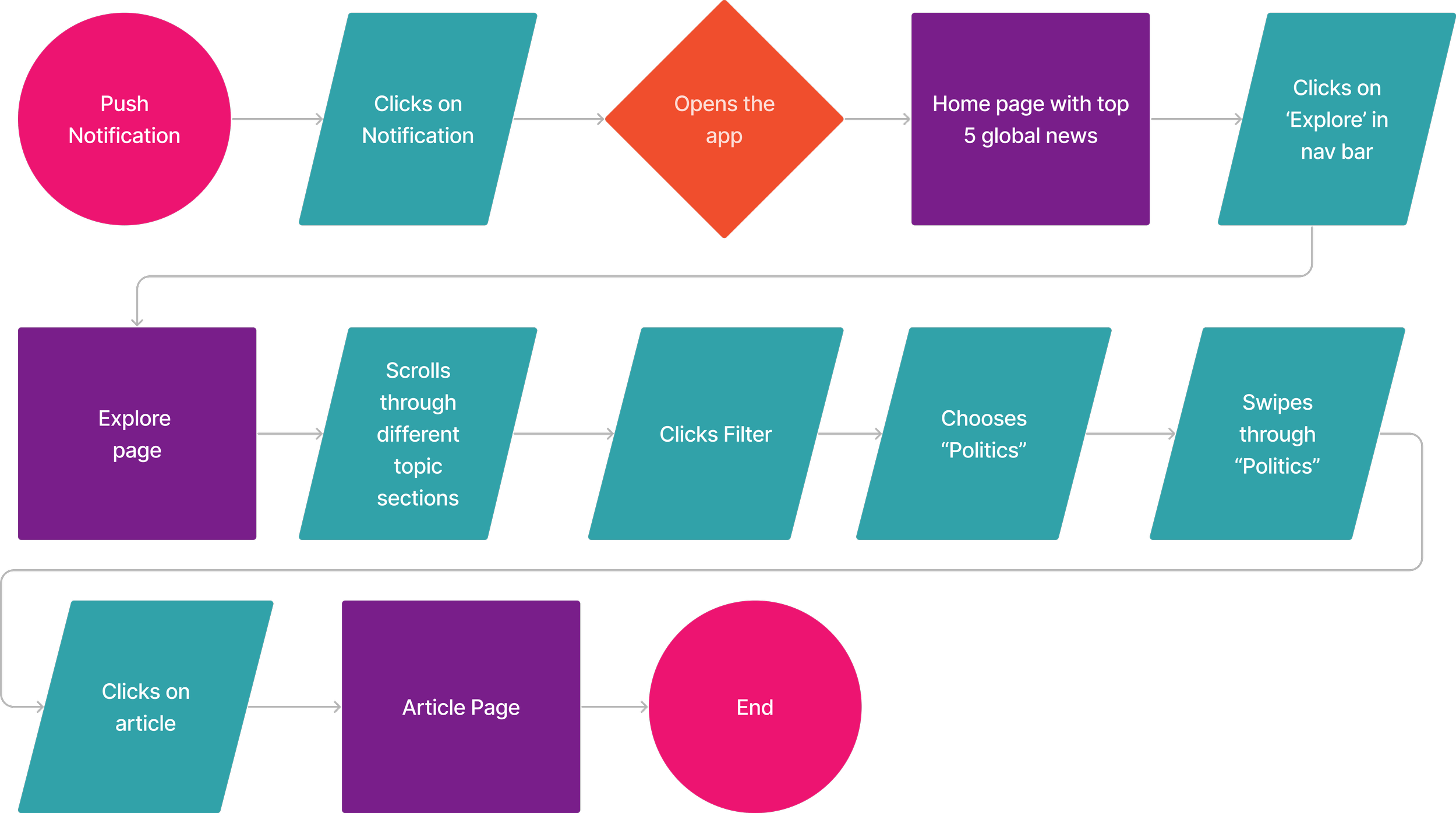
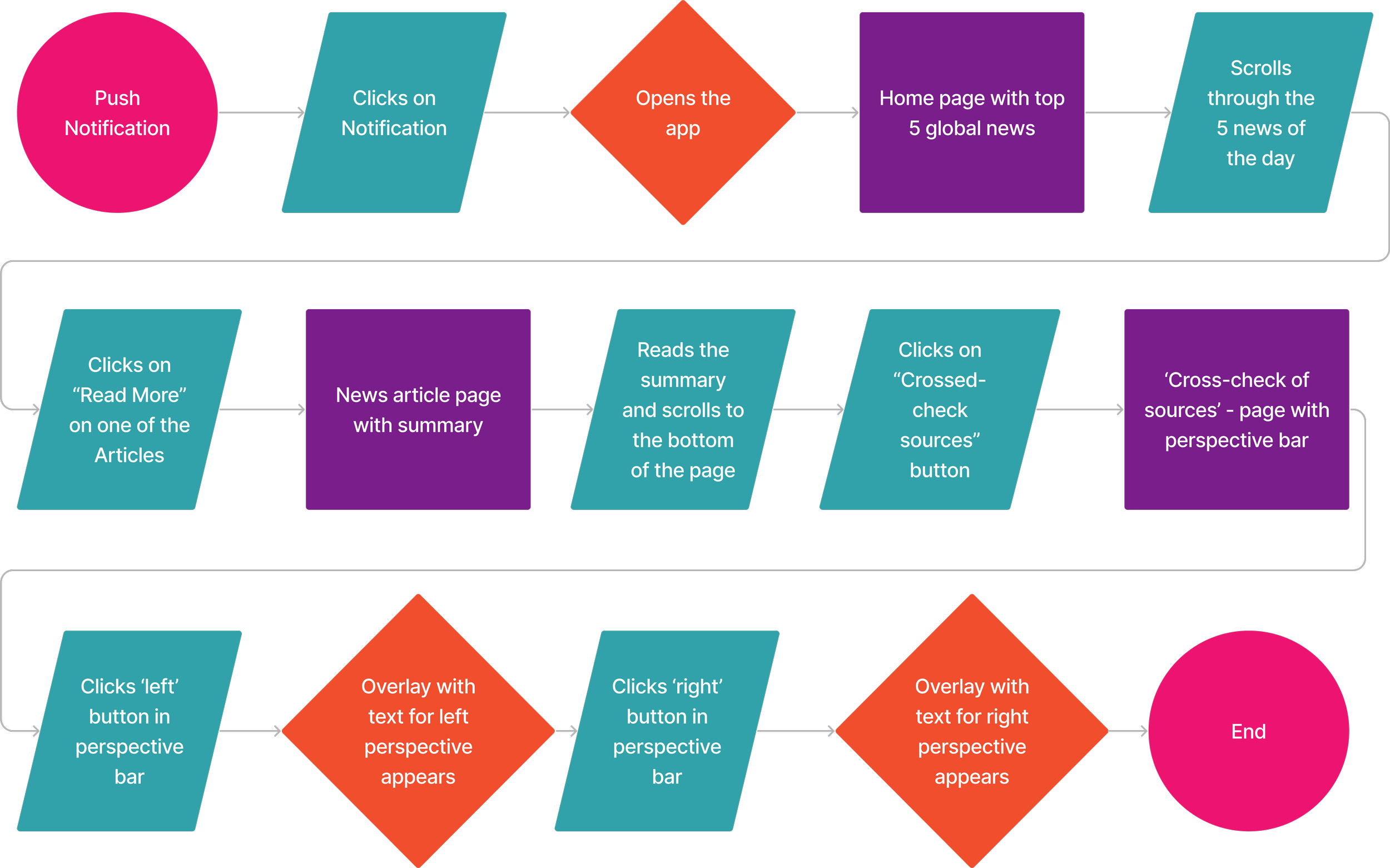
Explore page: Create an explore page which gives users wide access to different news topics.
Team
I shared this project with André Fernandes & Isabelle Malmendier.
Deliverables
User Research: Heuristic analysis, Competitor analysis, Survey, Interviews, User persona, User journey map, Problem statement, Ideation, Prioritization, User flow, Lo-fi wireframes, Concept testing, Mid-fi wireframes, Usability testing.
Visual Design: Branding, Style tile, Accessibility testing, Desirability testing, Hi-fi wireframes, Interactive prototype, Micro interactions.
Timeline
10 days (March 2023)


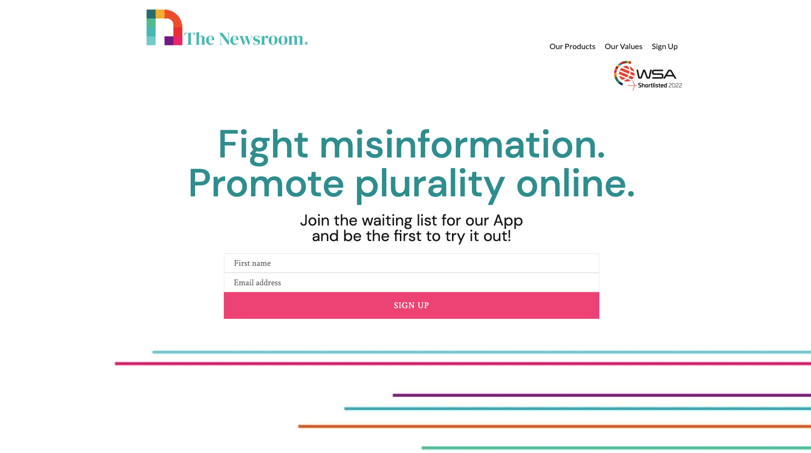
About
Portuguese startup
Self-developed explainable AI
Separate fact from opinion
Check trustworthiness of online news
Unbiased and transparent information
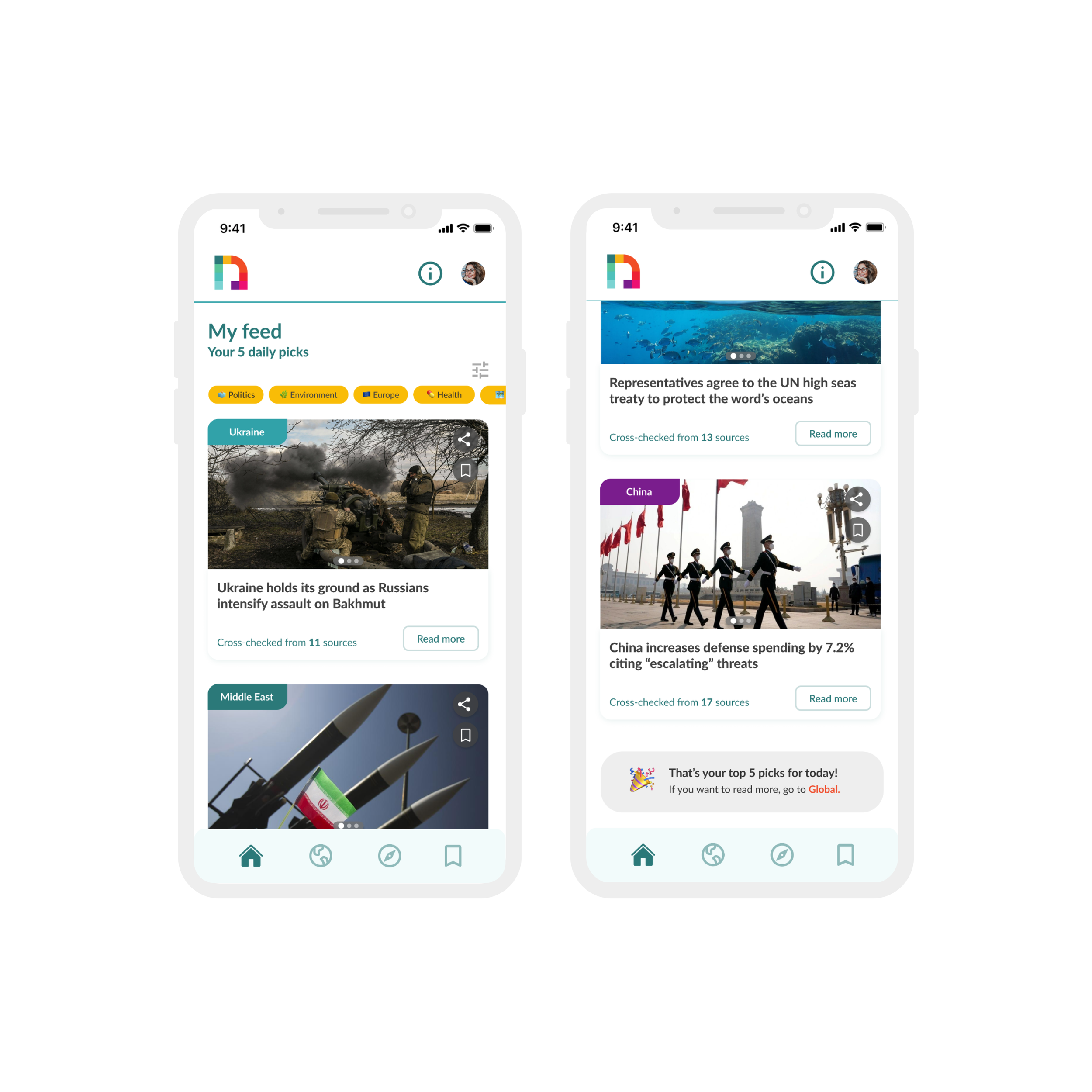
Less overwhelming with only 5 news/days
Analyzing the existing pain points of the Newsroom’s app
The first step for us was to have a deep look into the existing app and conduct a heuristics analysis to better understand the current pain points.
Key findings:
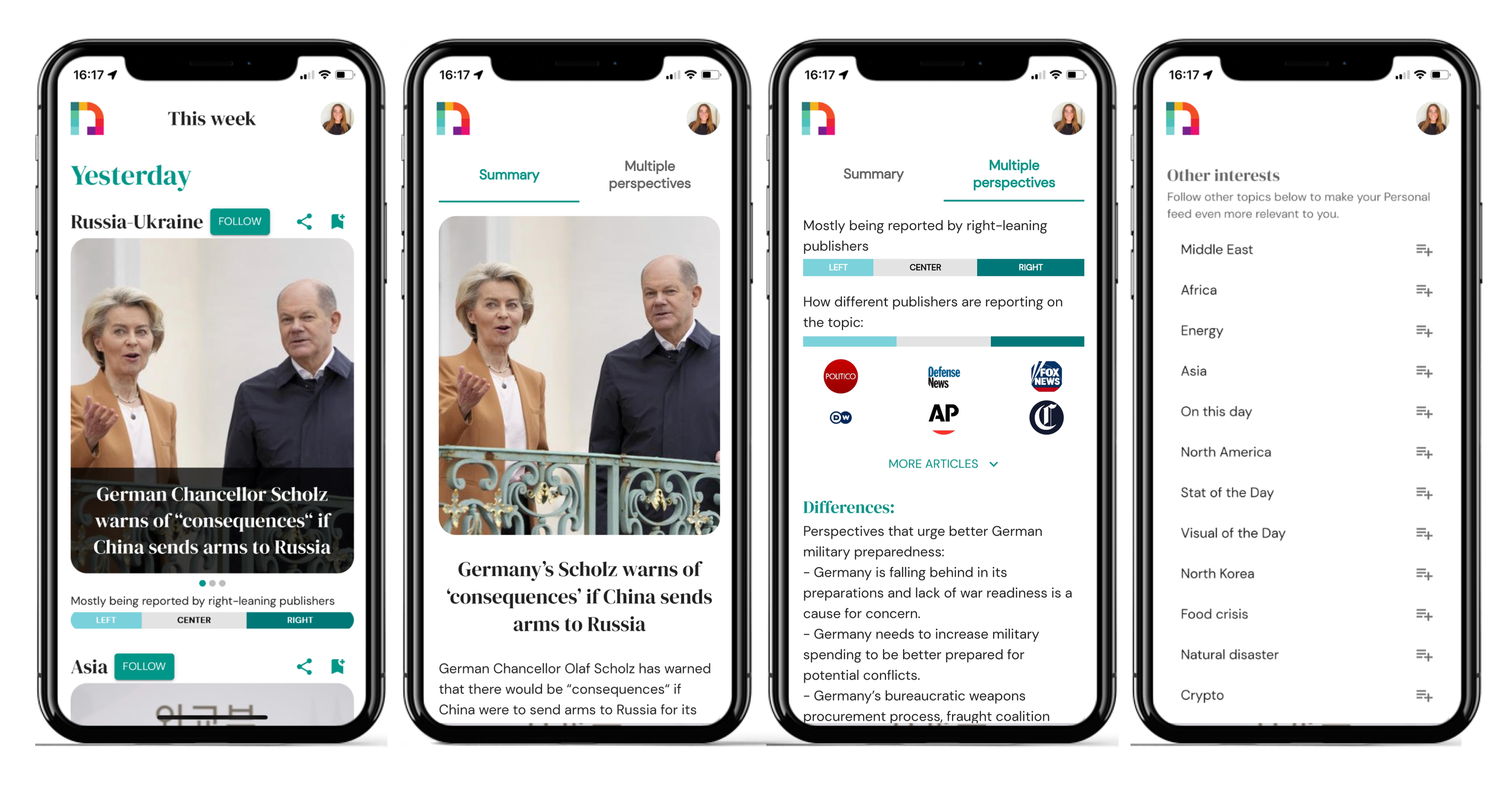
Category tag for the topic is not recognizable.
Swipe function and political positioning bar is confusing.
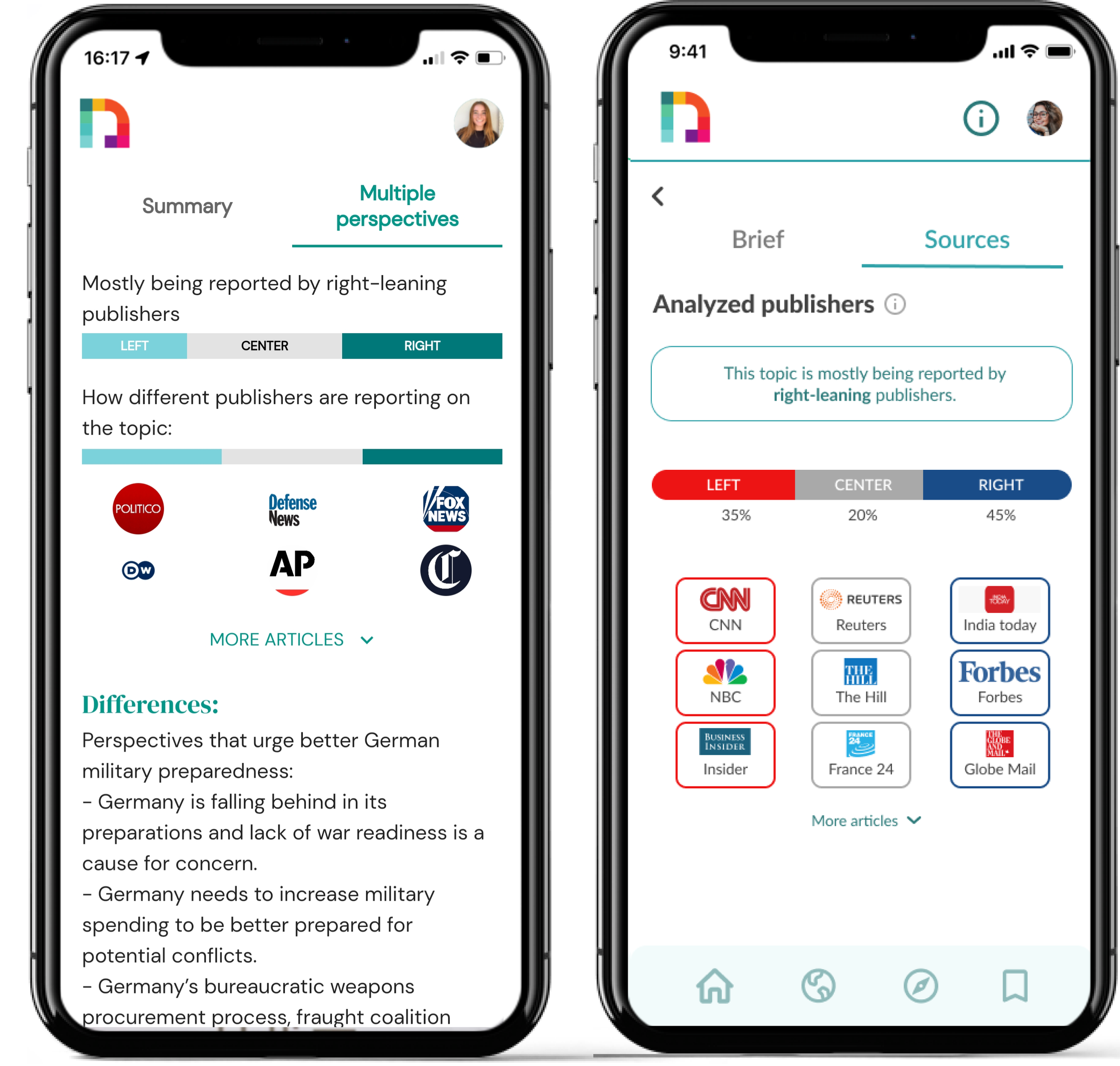
Difficult to understand how information are generated and separated.
Logos of publishers is challenging to understand which belongs to which news publisher.
Interest section in the personal profile section is overwhelming.
The Newsroom has an unique approach in the market
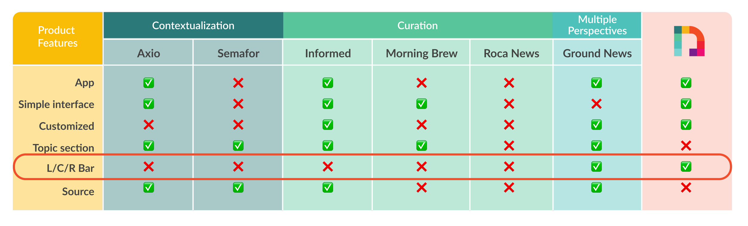
We analyzed the product features of six different companies and discovered potential for The Newsroom in:
including a section with different topics.
the possibility for personalization.
highlighting the sources of published articles.
The political bar of the Newsroom which displays a publisher’s right, left or center leaning, is a strong unique selling point.
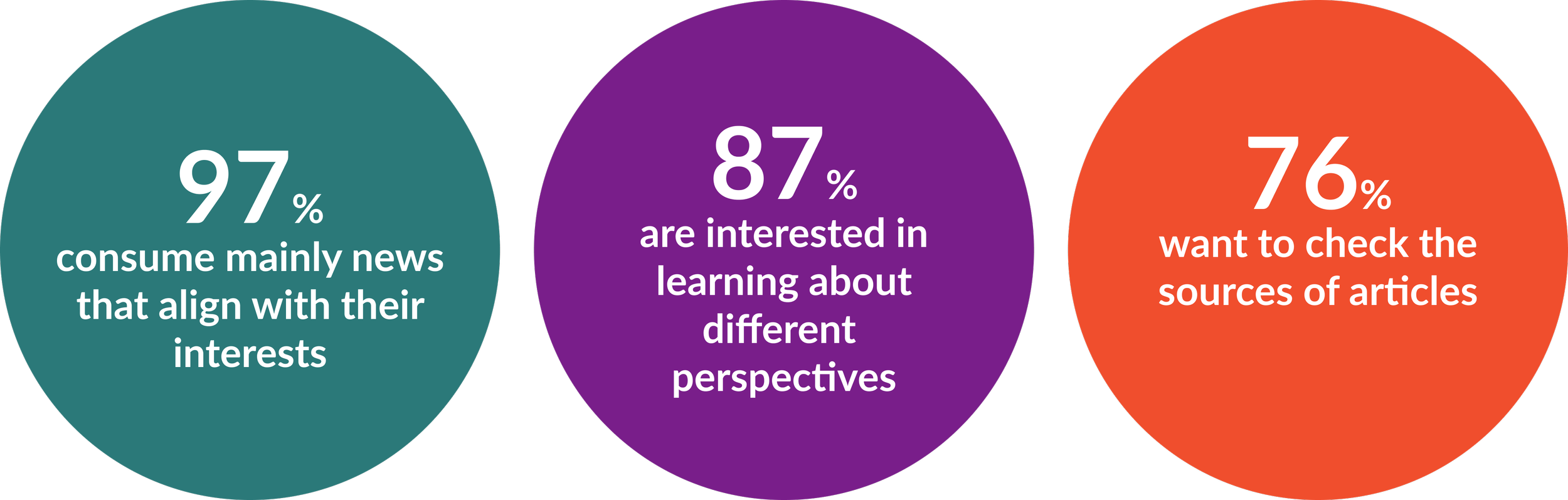
Asking 97 people about their news consumption behavior
We conducted a survey with 97 responses from potential users and gained following insights on their news consumption behavior:
More than 1 out 2 consume news daily.
67% want to know which political side (left/right/center) is reporting on a specific topic.
61% want a customized feed regarding their interests.
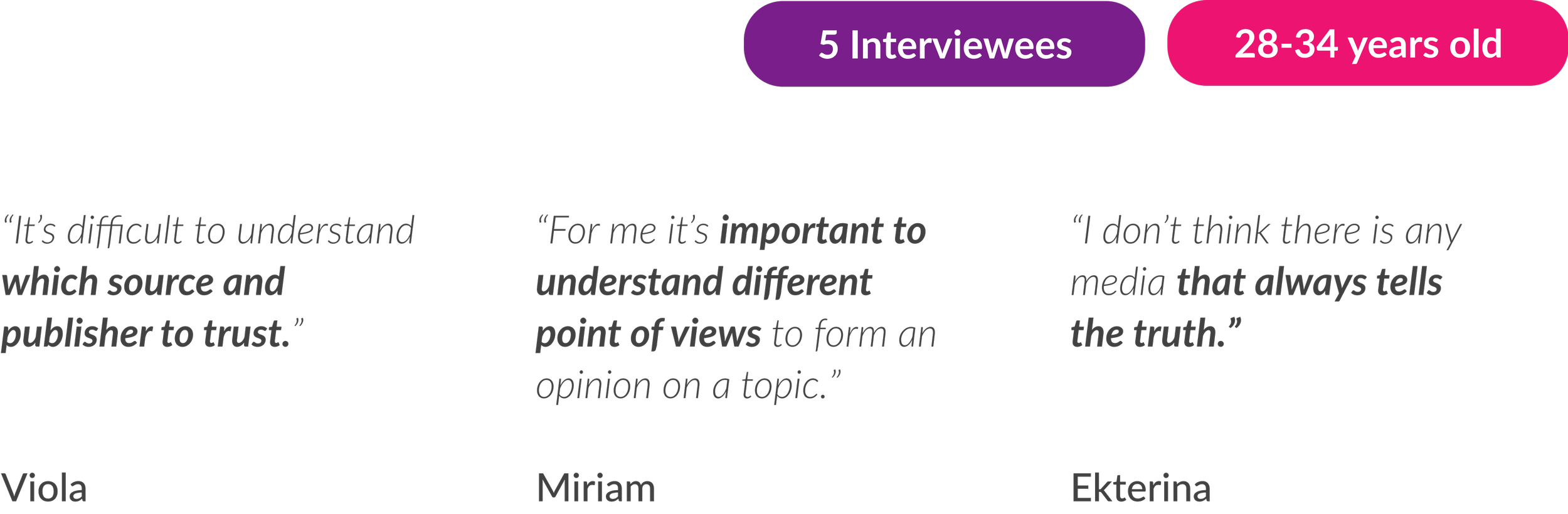
The interviewees struggle to understand which source to trust
The survey already gives us many great insights to frame the needs of the potential users, but we need further information about the thoughts and pain points of them.
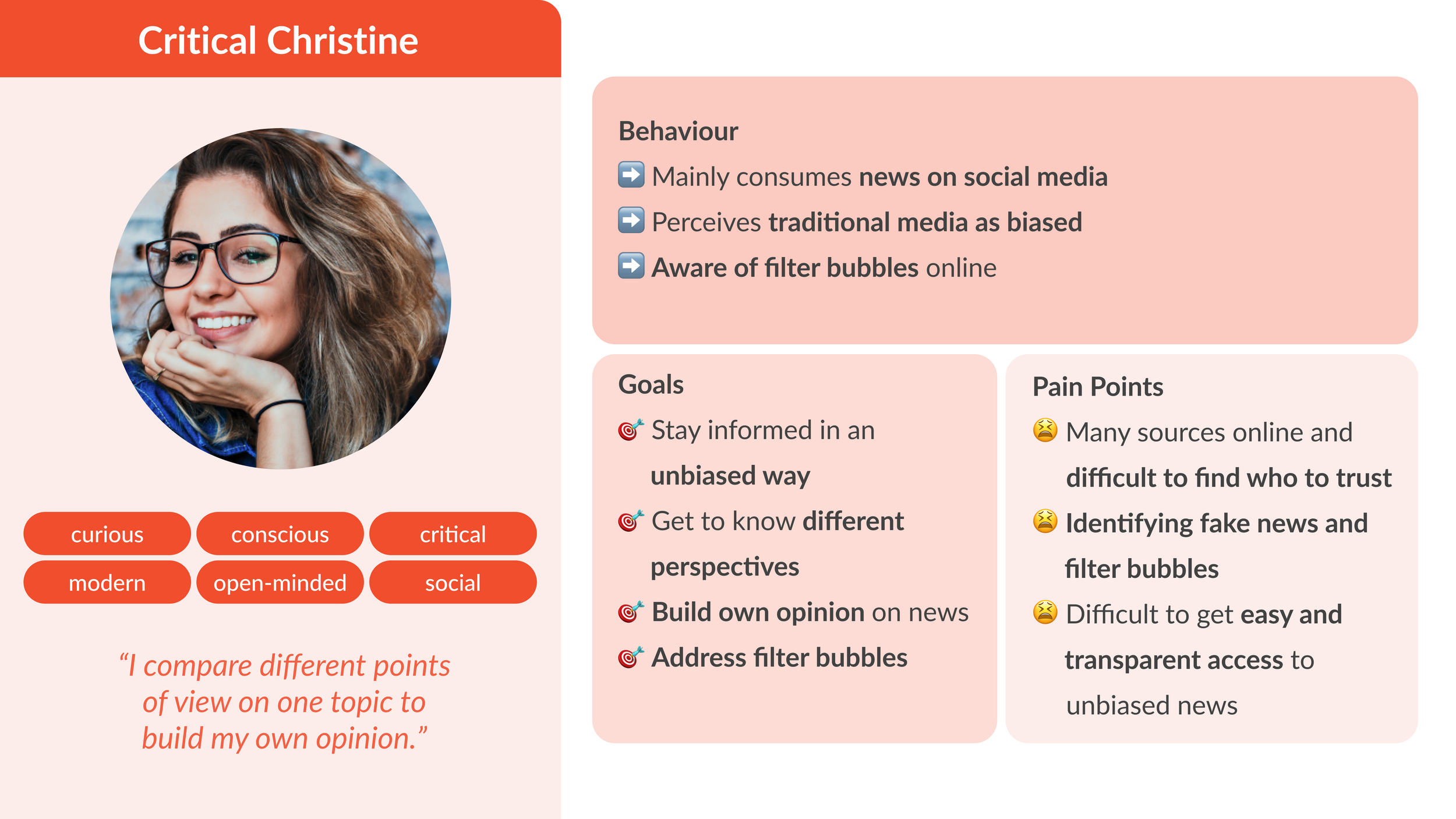
Hi, Critical Christine!
How can we help you to trust news online?
After analyzing the existing pain points of the app, the competitors and conducting the interviews and survey, we defined the needs, goals and pain points of the user persona.
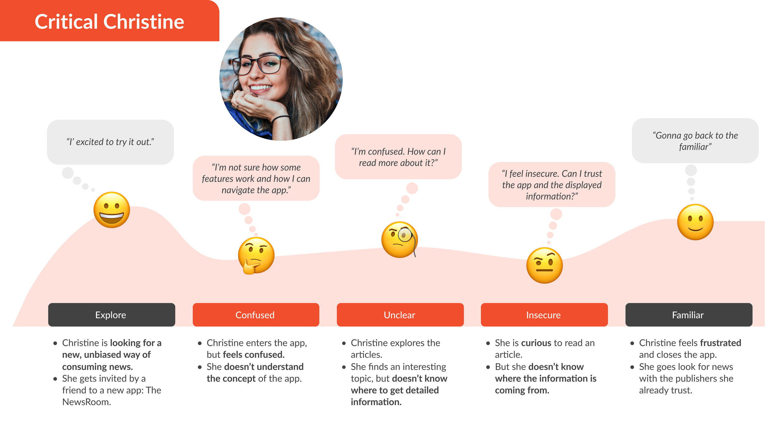
Defining the problem for people like Christine
Curious, but non-avid readers who want to stay informed but perceive news as biased and overwhelming, find the Newsroom’s navigation counter-intuitive, or don’t immediately understand how the app solves their needs.
To better empathize with her, we created a user journey map, describing her attempt to consume news in a new and unbiased way and for that, downloading the app: The Newsroom.
Ideating on the right problems to turn her struggles into opportunities
HMW help Christine to navigate through the app?
HMW explain the AI concept and value proposition?
HMW provide clear overviews?
HMW might we clarify sources?
HMW display content in a more engaging way?
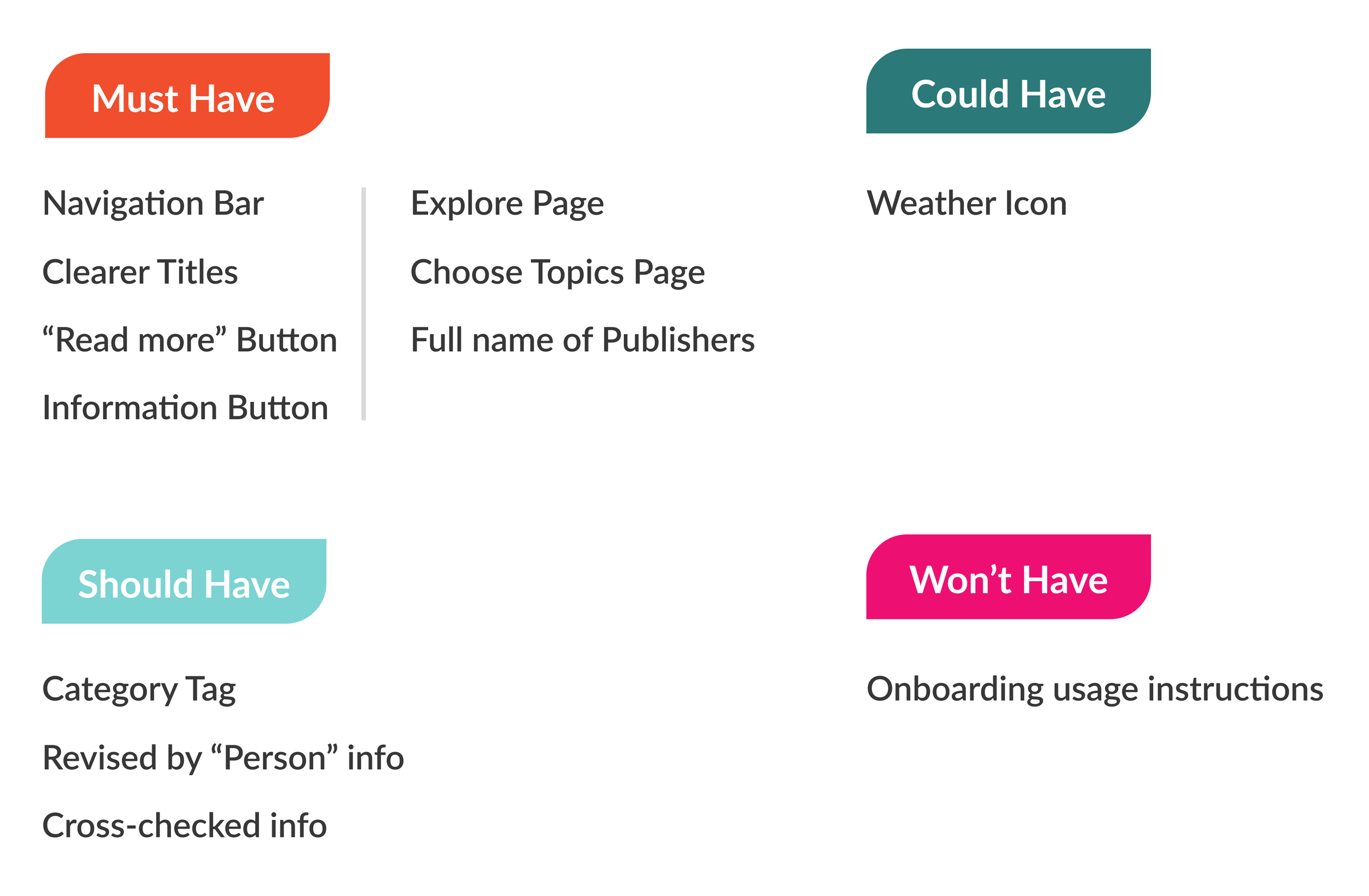
Narrowing the focus: which of our ideas will take center stage?
After understanding the right problems to focus on, we brainstormed on potential solutions and how to visualize them. With the help of the MoSCoW Method, we were able to prioritize them.
Two user flows for simple navigation and seamless exploration
Main user flow
Explore-page user flow
First concept sketches and testings for the new app version
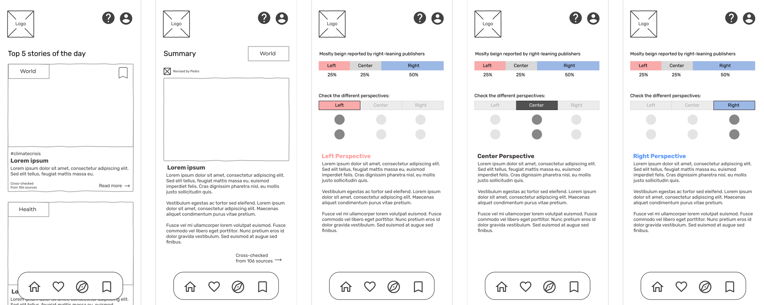
In a next step, we were able to create concept sketches for the new version and to conduct concept testings.
Feedback Concept Testing:
Political bar and its associated text, which presents various perspectives, are still unclear.
Multiple pages and dedicated icons in the navigation bar to be confusing.
Page displaying their personal interests and preferences be the first page, with global news on another separate page.
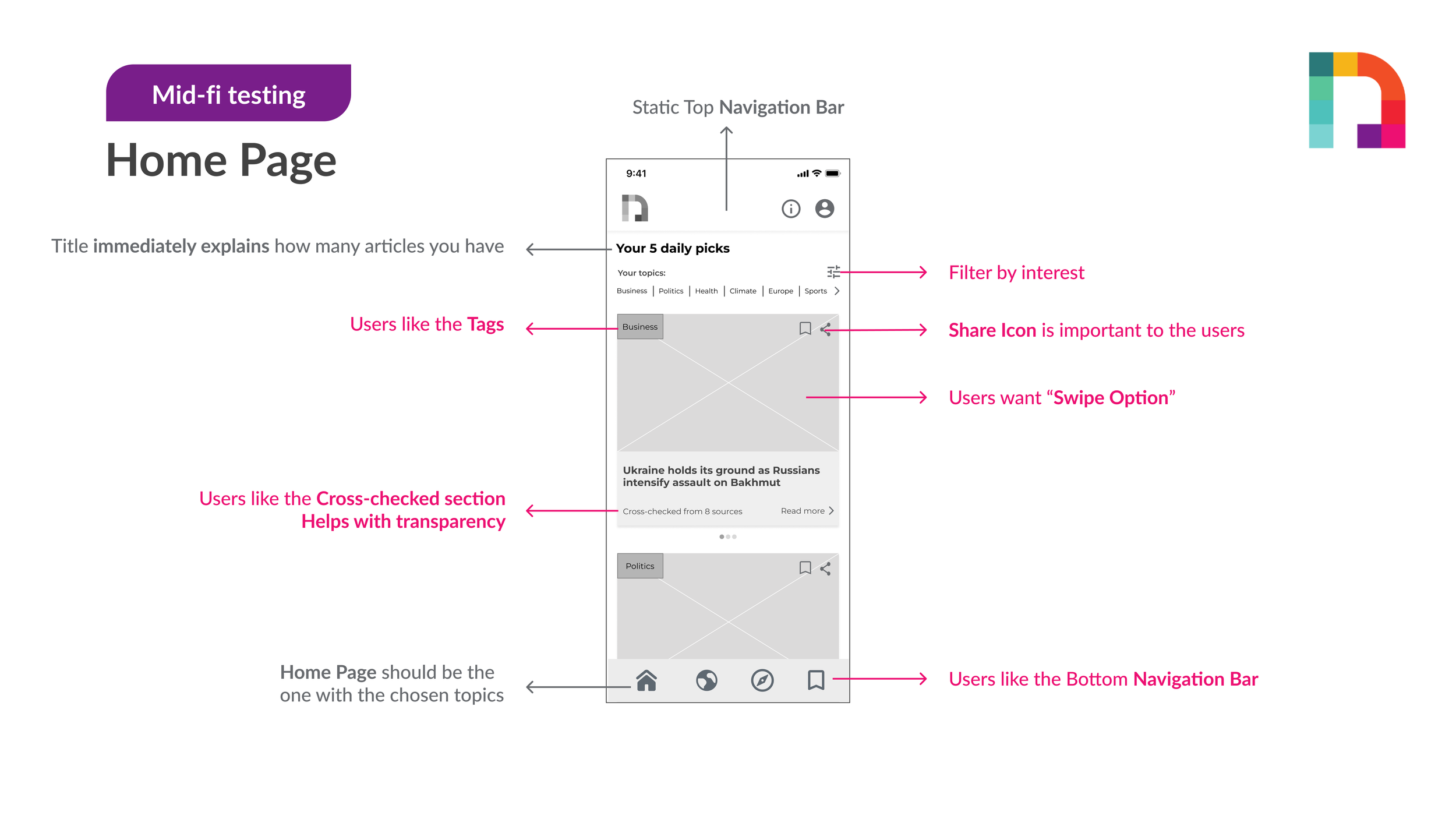
From Mid-Fi to high impact: using usability testings to refine detailed changes
To make it easier and clearer to conduct further usability testing, we converted our Lo-fi wireframes into Mid-fi wireframes.
We then proceeded to test our Mid-fi wireframes with actual and potential users and incorporated changes based on their feedback through an iterative process.
Making the visual design clean with a modern touch
We kept the existing logo as the founders also perceived positive feedback and recognition with that.
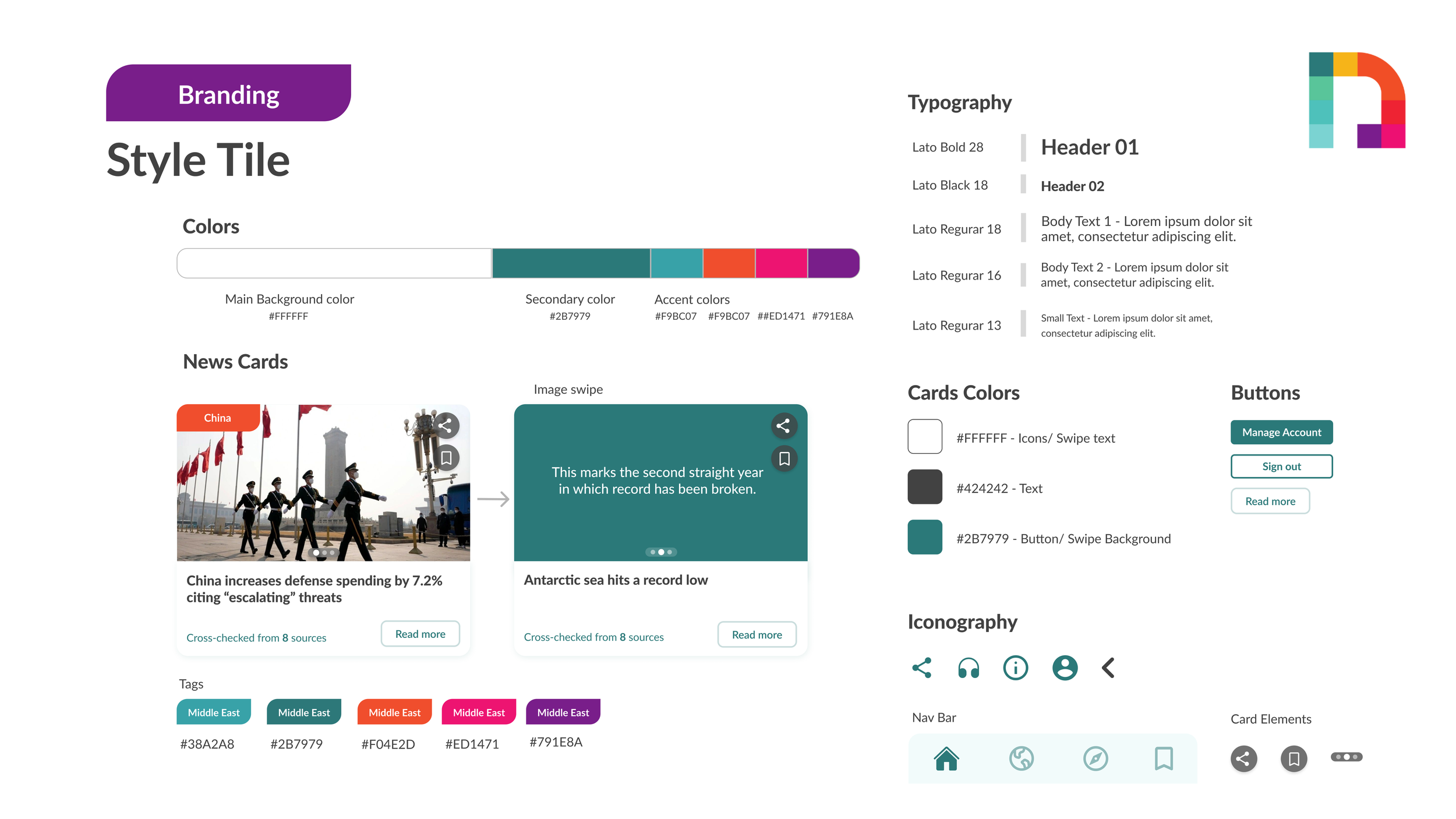
Color
Goal: maintain minimalistic design approach that allows the news articles’ content to speak for itself.
Recommendation: incorporating the logo’s colors as highlights to make it more appealing to our target audience.
Typography
Recommendation: change to Lato, a sans-serif font, for better readability instead of the current serif font used for titles.
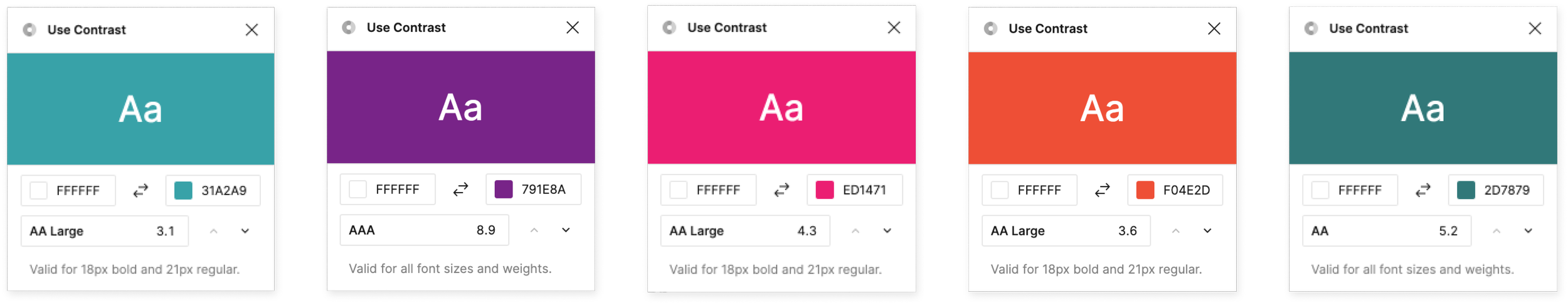
Accessibility testing: All colors provide enough contrast
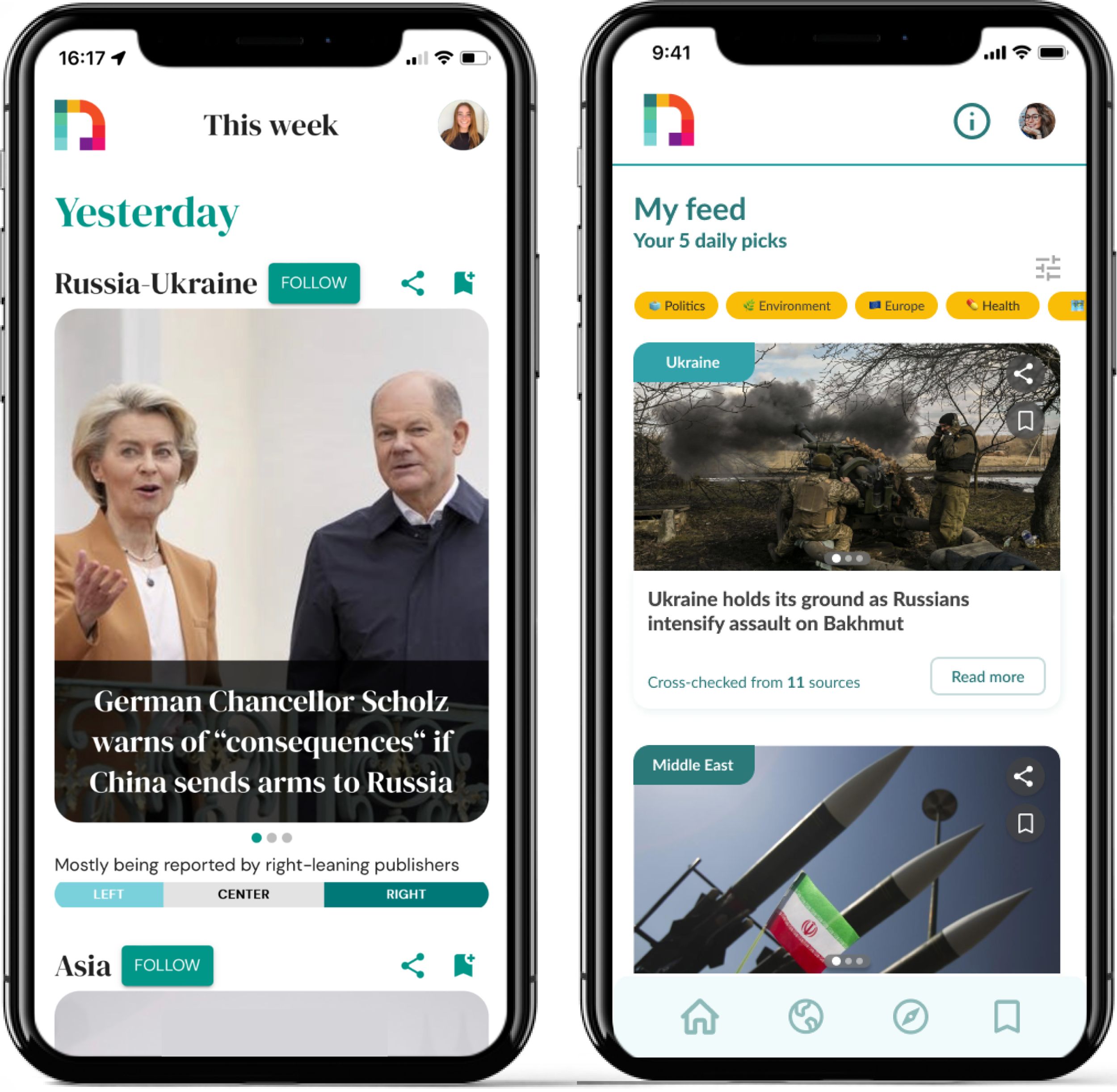
Before - After
Watch the prototype in action
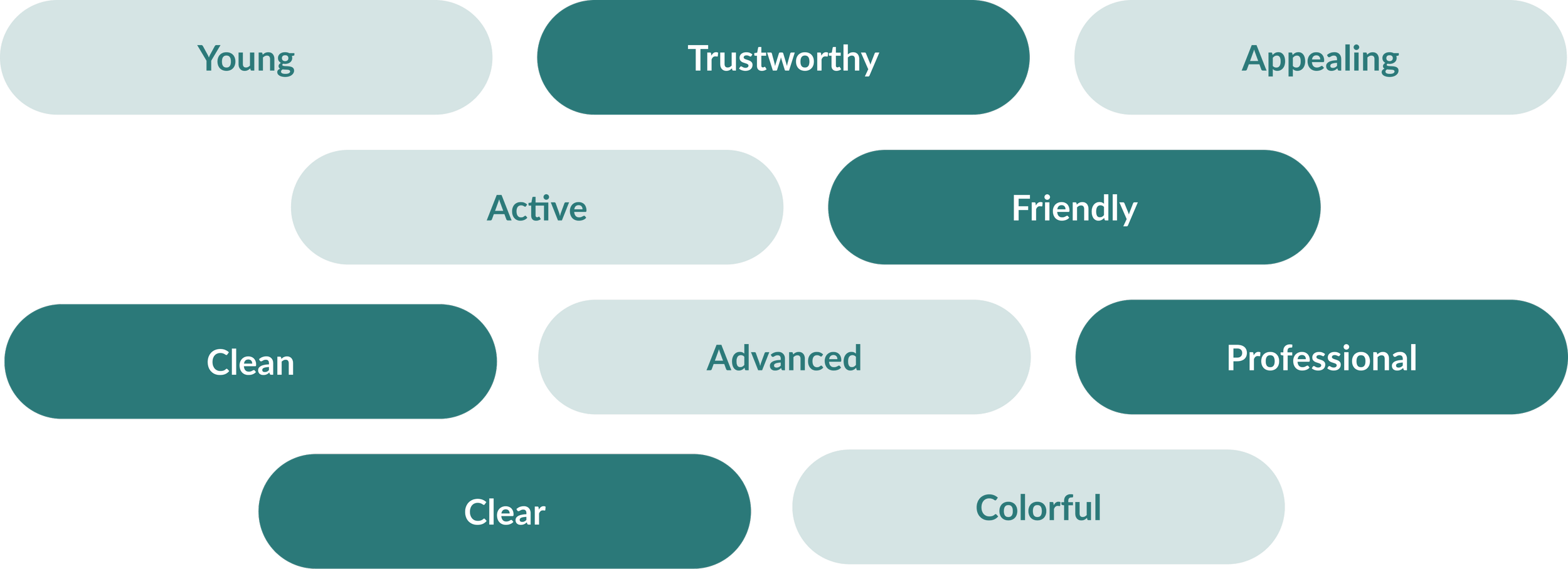
Desirability testing proves success in user appeal
We shared a preview of our Hi-fi wireframes with a list of different adjectives and asked the respondents to choose words that they would most associate with our design.
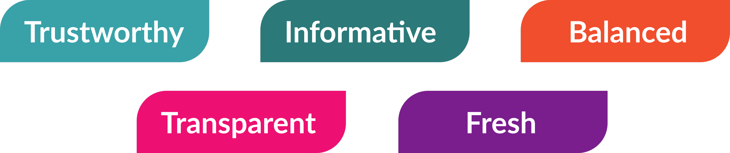
Within 14 responses, the majority matched with our previously defined Look & Feel: Trustworthy, Friendly, Professional, Clean, Clear.
Next steps
Handing over the work to the client.
Perform more testings for validation.
Implement a new onboarding process.
Improve the filters by creating precise categories.